Showing posts with label review. Show all posts

Sunday 10 April 2022

G.I. Joe Retro Collection Cobra H.I.S.S III (with Rip It): The camera really does add mass.

Apologies for the month's hiatus. A combination of events including a return to work, lack of new toys that I feel could hold up a review on their own (I don't hear many requests for a review of the Lego Microfighters Razor Crest), an upcoming review on the other site for Pokemon Legends Arceus and work behind the scenes on recording more parts of Pokemon Mystery Dungeon: Explorers of Sky for the RAWs channel. I do have something, though, that can be considered almost a prequel for a future review. Announced at the Hasbro Pulse live stream for the anniversary of G.I. Joe, fans of both G.I. Joe and Transformers will eventually be treated to a crossover toy, with Megatron transforming into a Cobra H.I.S.S. Tank. According to the stream, this will be the same size as a vintage H.I.S.S. Tank, as the toy will come with a Retro Baroness figure. So naturally, this got me curious about potentially reviewing a H.I.S.S. Tank, to do something many Transformers fans rarely get to do: compare the toy to the vehicle it's based on. One roughly $90 purchase from Amazon U.S. later, and the H.I.S.S. III is in my collection, as it was cheaper for me to get this than to find a complete vintage H.I.S.S. It even comes in Soundwave blue to act as a nice holdover until I potentially... hopefully... unlikely get that SDCC toy. Anyway, here's a review of the H.I.S.S. III.


I'll start this review by looking at Rip It, who, according to his bio sentences, can't even be described with words like mean and fearless. I might be more impressed if I saw the original card, but thanks to multi-language requirements, all I get is two sentences about how he wants to destroy things before being destroyed. I'm certainly more impressed with this guy than I am with my experiences with the Star Wars Vintage Collection, thanks to all the articulation in him. This figure is, to me, surprisingly agile. The only joint I wish he had (thanks to the Classified line spoiling me) is an inward ankle tilt. While it might be because of the extra vest over the torso, something I am looking to get a better feel of going forward, I don't see the point in bringing back the rubber O-Ring that was used in the 80s to add what would best be described as a waist swivel halfway up the stomach. While I acknowledge that these are effectively re-releases, and changing them would be akin to changing joints on Transformers G1 reissues, it somewhat fails as a selling point for me, as I've seen many other ways to do this style of movement that came out after the '80s. While Rip It and the H.I.S.S. III are 2000's toys; they are re-releases of the original H.I.S.S. Tank from the '80s, with most of Rip It's parts coming from the moulds used for the original H.I.S.S. Tank driver (except for the waist, which came from the 1992 Talking Battle Commander version of Cobra Commander). A potential Quality Control fault of my copy is his inability to stand straight. The legs want to snap back to have him lean forward a little, but this isn't the end of the world as he looks great when sitting down in the tank's cockpit. All it does is make the stand he comes with that bit more redundant for me. Still, he makes for a nice accompanying piece for the tank but wouldn't be anything special on his own.


Beauty in simplicity best describes the original H.I.S.S. Tank. While other versions have caught my interest thanks to how they deviate while keeping to the feel of the original (such as the 2005 version and the 2012 versions), there's still a nice charm to the original design. As with most of the parts for Rip It, this is, as far as I can tell, a repaint of the original H.I.S.S. Tank, with the only differences being the plastic colour the main body was moulded in, new paint on the tank treads, and new sticker details. There may also be differences in plastics used between releases, but if all you want is a H.I.S.S. Tank, and don't care about it not being black, then this is a valid version to get, based on looks alone. It is amusing to look at this toy after seeing how insane some of the later Cobra vehicles became in the 80s and 90s, along with how later incarnations deviate from the original look. This tank looks and feels underpowered and reserved in comparison, like looking at a picture of a Star-Wars AT-AT, without the context of the size, and comparing it to vehicles like the AT-TE and the AT-M6. Not the toy's fault of course; time is just cruel. In terms of functions, you have a set of fake wheels to allow the tank to move, though it is a shame that the wheels are locked as pairs rather than four stand-alone wheels as it makes turning harder to do. You also have a rotating turret with the linked guns to angle up and down. A tow hook is on the back of the tank, which gives it compatibility with the tow vehicles from around the time of the original H.I.S.S. Tank, but something I'm not sure can be easily used now as I don't know if said vehicles have been re-released. A figure can be seated in the cockpit quite comfortably with the windscreen able to close over them; however, hairstyle and accessories may become an issue, with three more figures able to hitch a ride thanks to the turret having room for a gunner. Two plugs on the back of the tank give space for two more figures to stand on and hitch a ride. It's certainly not the most action-packed toy, but considering it was likely intended as a moderately priced toy, not the big toy for the year but not one of the smallest either, it does the job very well. I was surprised by how small it was and the box it came in. From what I had seen, I was expecting something a little bigger, with a box much larger. It's making me question if I actually would have the room for one of those Haslab Skystrikers, but even if I did, I didn't order one, so it won't be an issue. 


The H.I.S.S. III is in an interesting position for me when it comes to summing up my views on it and figuring out if it's worth it. Hasbro reissues of Transformers aren't generally worth the cost; I believe they're overpriced for what they are (at least they are here in Australia). The main reason for this is that they've often shared shelf space with the modern versions of the characters that are cheaper, can do more, and are just overall better toys. Rip It would fall into this category as well, as while there is no Classified version of him yet, it's hard to say, "yes, go get a new version of this 80's figure that costs more then the larger figure with more paint applications, more detailed sculpting and more articulation". But there is no modern H.I.S.S. Tank on the shelves right now (at least here in Australia, where there isn't any version of the H.I.S.S. Tank on shelves). Sure, Megatron H.I.S.S. is coming out in a few months, and while that objectively does more than the H.I.S.S. III, it's cheating to do that by being a Transformer. By modern standards, I wouldn't say the H.I.S.S. III is a good toy, but I'd be lying if I said I wasn't happy with it. The H.I.S.S. Tank is an iconic vehicle from the Real American Hero toyline, and just having a version of the tank is a delight for someone who likes the vehicles. Bringing cost back into consideration, I believe this is a cheaper way to get a copy of the toy compared to purchasing a vintage one; however, I'm not in the know when it comes to vintage G.I. Joe toy buying outside of Facebook live streams and eBay (which at time of writing didn't have a vintage copy listed anywhere). In that regard, I do think it's worth it, but in saying that, I wish there were a Classified equivalent line for bringing new versions of the vehicles to collectors' hands (albeit not in a 6-inch scale, some of those vehicles would be massive at that size). If you are a fan of the tank itself, this is a great way to get it.

Sunday 13 February 2022

Lego Ideas 21331; Sonic the Hedgehog Green Hill Zone: "Cubing around at the speed of none"

There are certain franchises where the moment a new game comes out, the announcement catches my attention. Sometimes it's for the high quality tied to the IP; other times, it's a mixed bag that I can't help but see where the coin landed. Sonic the Hedgehog is one of those franchises. One moment, you could be playing a finely tuned, beautifully designed game; the next, you could be playing a glitchy, broken mess where you wonder how it got through certification. Even re-releases aren't immune to the coin toss, with games like Sonic Genesis for the Game Boy Advance being a horrible port of the original Genesis/ Mega Drive game, and last year's "remaster" of Sonic Colours (see the Mediaholics RAWs channel if you want to see a small selection of the issues I came across while playing the Switch Port). There are many reasons why the Sonic community is an Internet Punching bag, but for better or worse, Sonic still lives on. Though it didn't make his 30th birthday, Lego did put out a set themed to the iconic Hedgehog and with Lego Super Mario still refusing to give the vocal minority of the community Minifig scaled sets, and we can use this to see if it's something we actually want. Welcome to the Green Hill Zone!


Right off the bat, there is a bit of controversy to this set. Due to this being a Lego Ideas set, it started life as a project pitch that Lego fans could vote on to get it to a review process. Those who have been keeping up with the reviews process for Ideas sets would know that while this was a Sonic set themed to Green Hill Zone, it wasn't themed to the original Sonic the Hedgehog game but rather one of the more recent retreads to the zone in Sonic Mania. The inclusion of two Hard-Boiled Heavies and the Death Egg Robot were the most significant elements to this theme that were dropped to make it based on the original zone. Personally, I think this change is for the better, as it makes things more consistent. Because of how frequently used Green Hill Zone as a level theme is, keeping it a bit more generic handles many level tropes for Sonic. This can easily represent Green Hill Zone from Sonic 1, Sonic Adventure 2, Sonic Generations, Sonic Mania or Sonic Forces, Splash Hill from Sonic 4 Episode 1. Some may confuse it for Emerald Hill from Sonic 2, Neo Green Hill Zone from one of the Sonic Advance games, get a second copy, add another layout, and you can make this into the Green Hill Stage from Super Smash Brothers, or make a tube and call it Windy Hill Zone from Sonic Lost World. Though it does suck to lose things like the Flickies and the Death Egg Robot, I think this change is overall for the better. Does that make the set good, though?


There are some frustrating elements to it, the way the ground was done is quite tedious, and some of the uses of stickers is infuriating (particularly for the loop, as two parts need three stickers each). Even with those issues, it's hard to deny how good the set looks. When looking at Green Hill from a 2D perspective, it's a beautiful set, representing a nice miss mash of elements iconic to the stage and series. As tedious as it was to put all those 1x1 plates on, the ground looks beautiful, perfectly representing the checkerboard dirt of Green Hill. I love how they handled elements like the tree the floating rings (though it would have been nice if those were gold instead of yellow). The simple but effective mechanisms for the spring and checkpoint are nicely done, and the Motobug and Crabmeat look amazing when next to Sonic. The set encourages customization, with things like the stage built in interchangeable modules and optional alternate stickered plates for the item boxes and Motobug's head. I'm not surprised that the original fan designer has put out a set of instructions for alternate stage elements like a spike trap, a Buzzbomber, and other aspects of terrain to help expand it further if you purchase a second copy. It has a feel to it like the Architecture Great Wall of China in that regard. The main issue I have with the end result of the look is that I wish it were a little wider. Not including the decorative tiles on the side, the ground is four studs wide, which looks fine straight on for most positions where you can put Sonic, though it makes certain elements look cramped when you see the stage from other angles. There's not much space to get past the tree, especially the checkpoint. Perhaps six studs wide could have looked better? Unfortunately, the curse of taking something intended to be flat and bringing it into a three-dimensional world. The only other minor complaint I have is that something representing Sonic curled up in a ball would have been a nice touch, as there's another way to display your Sonic.


Alongside the badniks, you get a Dr Robotnik/ Eggman in his Egg Mobile and a little display stand for Sonic and the seven Chaos Emeralds. While the original game only had six, the emerald piece is likely very cheap to produce, and Sonic 1 was the only game to have six Emeralds; every other game since had seven (or seven collectable items of less than or equal to power). The stand is a nice little touch, and the action stand for Sonic gives him a dynamic pose while on the stand with the emeralds. Another missed opportunity might be the lack of a Super Sonic minifig, but it doesn't feel like a huge loss when in hand. Robotnik is a bit of a mixed bag. I love how they handled the Egg Mobile; it's a beautiful recreation of the sprite. The Eggman himself, though, not so much. Robotnik's sprite was always going to be difficult to replicate, he is, after all, a ball with limbs and a head, but the overall look feels wrong when standing on his own. The legs look good, but everything from the hips up doesn't do it for me. The fan designer has gone on record saying it was for stability reasons, something that I could see when putting it together, as it is a very stable, durable build. I just feel like there could have been other ways to handle elements like the head. I'm glad this wasn't a Bigfig like it was in Lego Dimensions, though the Bigfig scaled Eggmobile does look good in that game.


Looking at this set and comparing it to Lego Mario, I'm glad that Mario went in the direction it did, as it does lead to a wider variety of things in a consistent style. However, if Lego Mario were a line built in this style, I would likely lose my mind with all the repetition in assembly, thanks to how sprite-based games are made, especially in Mario. Does that make this a lousy set, though? No, quite the opposite. On its own, Lego Green Hill Zone is excellent, a nice collector's piece for fans of the consistently inconsistent speedster. I just don't think this has the potential to be a future line in this state (even if that would mean missing out on Lego Tails, Knuckles and Amy).

Sunday 30 January 2022

Action Force Sgt. Slaughter: At least I can't get demonetized for this.

 Let's start the year's reviews with something slightly different, shall we? It's rare to see complementary toy lines in today's day and age, isn't it? Sure, you'd get cases like the Transformers Studio Series 86 line and Generations Selects to help bolster the Generation 1 figures on shelves (because we need more of those...). Still, those feel like an extension, compared to a complement. Compare that to the '80s, and 90's Lego sets, particularly the Space themed sets where, even in separate lines, the sets still complemented each other, helped make Space feel a lot grander in scope. I bring this up because since learning of Valaverse's Action Force line, it's felt intended (at least partially) to complement the G.I. Joe Classified line. Valaverse heavily promoted the line to the dedicated G.I. Joe fans. The company owner is a former Hasbro designer that helped work on (among other brands) G.I. Joe and was likely aware of the Classified line long before the general public did. Combine that with the history of Action Force as a brand name is directly tied to the Joes, as Action Force was the name many G.I Joe: A Real American Hero toys and moulds were brought into the United Kingdom, even the inclusion of today's review subject, Robert Rudolph Remus, was one of the first real-life people to be included in the Real American Hero toyline under his wrestling persona, Sgt. Slaughter. While the Valaverse Action Force is its universe, with its own story its own characters, it feels like the intention was always to balance the legacies of the brands (a history and heritage I do recommend looking up, as it is a fascinating story). That's why today we're reviewing that main bridge, the big hook to try and convert fans of Classified. Welcome to the Slaughter House.


One thing to bring up early on, this is not based on any version of Slaughter from the Real American Hero toyline. As far as I'm aware, this is an original design based on his wrestling persona. Based on the bio on the Valaverse website, this is a Slaughter that is somewhat past his prime. But, he still has a "toughened veteran" feel and is viewed as a threat to the Action Force's enemies: the Swarm (among other threats? I haven't read the comics they've been putting out on the story, I don't know if Bone Collector is an enemy, a mercenary, or something else). You get the feel of a veteran pulled out of retirement with this figure, but there's still enough of a sense of youth to the figure that allows him to still work as a Drill Sergeant. While he may not be the one breaking recruits in, there's still a sense of "recruits are probably still terrified of this man". There's still a sense of authority to him. Among one other in particular, the figure reminds me of a teacher at my old high school who was in charge of the school's Cadet Program. When in uniform, he also had that sense of authority to him.


While this does complement the Classified series, there are distinct differences compared to how Classified handles certain elements, Specific elements of the engineering are different. For example, Sculpt was kept a high priority for Slaughter, whereas many Classified figures prioritize articulation. Not to say that Slaughter is rigid, just that there were some compromises he makes that the Classified line doesn't, and vice versa. The way the stomach, for example: while it is as articulated as the Classified series, it's more natural to the way the human body works, thanks to the upper body and the hips having joints built into the stomach to handle an ab crunch and hip spin, compared to Classified's far more visible ratchet hinge. On the flip side of that, Slaughter's neck is more limited than necks like Duke's, and the extra joints incorporated in Duke's neck, and hips allow him to maintain the articulation without having visible gaps in the sculpt. However, this is only an issue in Slaughter's neck, as the dark green pants and jacket help hide the gap. 


One thing that does unobjectively put the Classified line to shame is the accessories. One thing I should mention is that there is a known issue with the first wave of Action Force toys, where the joints and ports are too stiff out of the box. Included is a letter from Valaverse regarding ways to help fix this, as it's mostly down to the internal seal of the joints. This issue is something that will be addressed for Wave 2 and onwards. I don't bring this up to bring down the figure, even though it affects my toy copy (mainly the hands). This wave of toys was kickstarted, the company itself is still young, and the transparency about the issue is appreciated. With that said, what do you get with the sarge? You get a wide variety of alternate hands, with both hands having a trigger hand, a neutral gripping hand, a fist, and a relaxed/ "Come on, try me!" hand. The right hand also gets a pointing hand, so you could do things like having a pointing contest with Cobra Commander. Unlike the Classified line, these hands use a very stiff plastic, meaning that the unique gripping hands are the only way you'll be able to get him to hold his two weapons: a revolver and a knife, both of which have dedicated holsters and sheaths on his thighs. Out of the two weapons, I prefer the knife thanks to sculpted details like the eagle head on the handle, but both weapons put many of the Classified lines weapons to shame thanks to them being beautifully painted. It's nice to have a silver revolver and silver blade. Slaughter also comes with a removable hat and sunglasses, the hat itself is a snug fit that won't easily come off unless you knock it, but the same can't be said for the sunglasses. It's the one major flaw I have with this toy, as I would have prefered to have a different head sculpt with the glasses moulded on. If you have Profit Director Destro, you'll be very familiar with how frustrating the glasses can be, and this pair has the same issue. I'll probably be getting some glue eventually and gluing them onto the head due to him never removing them in the cartoon (at least from memory. Again, not a wrestling fan). The final accessory is another that I wish the Classified line would come with, a display stand. It's nothing spectacular, as there are no painted details on it, but all the moulding detail helps give it a distinct look without becoming distracting. Considering as the designer, Bobby Vala, has gone on record saying the reason Classified doesn't come with things like stands and alternate hands is the perceived value of toylines like Marvel Legends and Star Wars: The Black Series, I'm not surprised to see all of these accessories here, and they all help bring life to the figure. 

No, I'm not a photographer. Why do you think I mainly use promo images?

While I can't say that this has convinced me to go all-in on Action Force, as many of the designs are a bit hit and miss for me (though if I could, I would probably get that Wasp Raider, nice to see Waspinator getting some love) it's hard to deny how good of a figure this is. You can tell that this was done with a lot of care put into it. This toy feels like an uncompromised love letter to the 80's military action figures. This figure does achieve what I believe the goals of this line are: a balance of old and new ideas, modernizing the concept of the military action figure while respecting the legacy of Action Force, its predecessor Action Man, and his American brother in arms, G.I. Joe. If you can only get one figure from the line, this is the one I recommend getting, though I don't think you could go wrong with any of them. Just be aware that this is a smaller company. These likely won't be as readily available as something like a Classified figure (though if you live in Australia, that's not saying much because Classified isn't readily available anyway). See you next week for the start of the Golden Disc Collection.

Friday 14 January 2022

Lego Super Mario 71391: Bowser's Airship Expansion Set: Behold, the airship that shouldn't be able to fly!

The Lego Super Mario Course Building sets have certainly been interesting, haven't they? At the time of writing, I've gotten almost every set put out at general retail for the Lego theme (not counting the ones released on January 1st). Within a year and a half, there have been almost 100 Lego Super Mario sets (when counting the character polybags as individual sets), the bulk of them have been for the course builder, and the majority of them have not been good sets on their own. That's not a bad thing, of course, as the sets are intended more for play, with the more sets purchased, the more variety you can make in your courses. That is the point of the gimmick, after all. However, what if a set didn't have to rely on the gimmick? Is that even possible?


Surprisingly, yes. Even though it's built around the play functions for the course builder sets, Bowser's Airship, the flagship (pun not intended) Lego Mario set of 2021, does find a happy compromise between the Course Builder requirements and an engaging, compelling set on its own. While you will still need either the Mario or Luigi starter packs to unlock the instructions, you could ignore all the other sets in the theme afterwards as you don't need them for this set (unless you want to include it in the course builder). The design of the build itself is really well done, capturing the look of the iconic vessel perfectly, to the point where this could potentially work as a minifig scaled Airship (if they ever do cave into the vocal minority's demands and make Mario Minifigs). I love the intricate details around the back of the ship, how the two Bowser heads were built, and how seamlessly the gimmicks intergrade into the set without any significant compromises is all absolutely brilliant. It gives the Airship a unique presence, something that I felt was missing from the 2020 flagship set, Bowser's Castle. 


There's very little to hate when bringing in the Course Builder elements if you're a Mario fan. A new starting point is given to you in the form of a black cannon which seems to be inspired by the cannons from the New Super Mario Bros games. When inserted in the cannon, you can hear an aiming sound effect play as you hinge the cannon up and down to aim it. Taking Mario or Luigi out of the cannon to start the level will have the first play a cannon blast sound effect and unique voice clip depending on the brother ("Here We Go!" for Mario and "Wahoo! for Luigi), like how they would be launched in the NSMB games. Once those finish, for the remaining 88 seconds (the cannon gives you 90 seconds on the clock), you hear the Airship theme from coming out of the Mario Brothers speakers. It's hard to tell what version of the theme due to the mixed quality of the file used; however, it is unmistakably the Airship theme. Using a hidden action tile on the ship, Mario or Luigi will play the World 5 theme from Super Mario Bros 3 when piloting the Airship (a "steering wheel" will also be exposed when either brother is put inside to complete the look). While random, it's hard not to smile at it as it's a lovely feature that doesn't compromise the build in any way.


Further Action Tiles include one for a Goomba wearing a Pirate Hat, one for a new to this set, Rocky Wrench that uses the hole to pilot the Airship to hide in and poke out of thanks to the inclusion of a POW Block (another action tile object). Finally, in terms of minions, you have Kamek and his broom, both of which the brothers can interact with, either by getting coins from a defeated Kamek or by riding his broom to collect more coins. While some Mario characters translate better to Lego than others, given the aesthetic they go for, I still love all of these guys, with Kamek probably being my favourite in the set. 


Alongside being a gorgeous display piece, the Airship itself can act as a three-phase boss fight in the Course Builder system. Two hidden tiles, one under one of the propellers and one on the Bowser head at the ship's back, act as the Airship's main health points. However, by opening the ship up, you can expose a mechanism to "fight" the robotic Bowser hand you see in games like New Super Mario Bros U (sadly, you'll need to build your own overly long arm for it). However, the mechanism is quite clunky when using the arm's mechanism for exposing the Action tile when it is still attached to the Airship. Realizing this, the designers included a way to take the two propeller mast towers and give you enough parts to create a mini level using them without needing to fumble around with the Airship in the time limit. It's a great compromise to help keep the set looking as good as it does when compressed up and as the Airship. 


Unfortunately, this kind of style probably won't be carried over into future sets. With a lot of iconic areas of Super Mario revolving around locations and geographical/ architectural design, it'll be harder to bring those elements into the course builder style in a way that can keep them looking good on their own. That being said, this does give hope for designs like The Odyssey and Starship Mario (as tempting as it is to say the Comet Observatory, that would probably be on a similar scale to the Mario 64 Question Mark Block's world builds). This set isn't just some bits of the ground around a contraption; this looks like Bowser's Airship. Anyone who sees this will know that this is Bowser's Airship, and the playability that it comes with makes the build even better. Without a doubt, this is one of, if not the best, course Builder set in the Lego Mario theme, and one I recommend getting to anyone who's a fan of Mario. 


As a final note, it should be said that this review was a collaboration project with Toy Reel, a YouTube channel and Facebook page dedicated to toy collecting in all it's forms, focusing on the Australian toy collecting scene. You can find their Facebook page here: https://www.facebook.com/ToyReel/ please check them out, they're a great group of people with a passion for toys. Until next time, "Bye Bye".

Sunday 12 December 2021

Transformers War For Cybertron Haslab Unicron: Behold, the Chaos Bringer!

 What could end 2021? What could be the final review of the year, a final send off to the year that reminded us "things could get worse"? Up until the last week before it was released, I did have this guy on pre-order but ended up cancelling it due to the rocky nature of 2021. JobKeeper was ending. Work wasn't restarting reliably; it was hard to justify an $800 toy with no stable income coming in. So, I wrote it off, thinking I wouldn't get a chance to see it in person, let alone review it. Well, that chance would eventually come when Melbourne's version of Oz Comic-Con came around. On Wednesday Night group chats for the Transformers Collectors Club Australia, I said I'd be willing to help them with events as, to quote myself, "it's what I do for a living anyway." The current president of the club backed Unicron and brought his copy along to the event, and it's thanks to him that I was able to work on this review. Notes were taken at the show, though, and while I didn't get a chance to transform him, I did pay close attention to him transforming it, along with the transformation videos on YouTube by others who have reviewed it. Logistically, this was the best way to get this review done, even if it means it's not as thorough as other reviews have been in the past. 


I'll start with the accessories, as most are nothing to write home about. The largest and necessary one is a display stand primarily for the planet mode. While the robot can support its weight in robot mode, the stand can remain attached to the figure in both modes and dramatically helps with the transformation. While elements like the removable back leg for the sake of moving the figure closer to the wall is an excellent addition, one thing it could have benefited from was a rotation point at the base of the main arm to help move all the weight during the transformation process. Due to the weight and all the ratchet joints in the figure, an inbuilt way to spin it would help immeasurably. Due to their small size, what wasn't on display at the booth was the nano figure of Galvatron, Hot Rod, and the Autobot Shuttle. Galvatron and Hot Rod are nothing special, but considering as the two characters are barely a centimetre tall, there's understandably not much to them. From what I've seen in other reviews, though, the Shuttle's well-sculpted and is an excellent small display in its own right, in a similar style to models like the old die-cast Star Trek ships, but on a much smaller scale. A nice pseudo accessory he comes with is a removable head. While it's not a Headmaster, the gimmick is a nice inclusion for those who want to display the head on its own and a battle-damaged alternate face to replicate its status in Season 3 of the cartoon. The head has its own separate stand that can hold the minifigures and ship mentioned above, with room to include the ones that come with the Generations Selects Behold Galvatron set. However, these are small fry to the main event.


As for Unicron himself, I was stunned seeing him for the first time in Planet Mode. Words can't describe how big this guy is. For what is effectively a ball with spikes, Unicron is genuinely impressive. The transformation is almost seamless, with the panel lines for transformation blending effortlessly into the sculpted detail. The planet mode is the most eye-catching model for Unicron, and even in this form, it's nice to see the gimmick with the maw, where all the teeth can move in unison if you spin the yellow ring around it. It's a nice novelty feature, even if it's not one many will use. The blast effects posts on both the planet and robot mode are... divisive for me. On the one hand, I like that he has them, as specific blast effects would work well on him to make it look like the Autobots and Decepticons are firing their most potent weapons at him. On the other hand, some of them are in awkward places, and the variety of effects parts isn't there to justify the feature, let alone the ones that would look good on him (ones like Earthrise Soundbarrier's, for example). While the planet mode looks good and is an excellent representation of Unicron's most iconic mode, it's hard to talk about what is essentially a plastic ball with spikes and a ring, so let's get to the more exciting mode.


In robot mode, the only way to describe Unicron is imposing. The biggest ever Transformer lives up to the name thanks to how big a footprint he takes up in any display. Unicron demands attention with even the most basic positions you place him in. However, you'll likely only be placing him in these basic positions because of how heavy he is and how strong the ratchet joints support his weight. With that said, though, almost everything you'd want to move for poses can move. Seeing it in person, the only thing I could think of that would be nice to move around more are the wings, having a hinge where they connect to the shoulders to splay them out more, but that is an incredibly small nitpick. Like in the planet mode, I love all the sculpted detail on him; every surface in both modes is sculpted beautifully. Even the wings, which are very hollow, look really good due to how purposeful the open spaces appear. It helps make look Unicron even bigger. However, one major flaw that many have with the toy is how the designers handled the execution. Unicron is a shell former; almost, if not all of the planet mode, ends up on either his shins or his back in robot mode. In photos, this does look bad, really bad. But in person, it's something that works to his advantage, as the kibble helps make him look even stronger, even more imposing. Could the engineering be improved? Yes, see "Totally not Zeta Toy's Totally not Unicron" that was announced simultaneously and released before this project was. But the issue with better integrating the planet into robot mode, the more frustrating the transformation is, something that I've seen first hand as transforming Unicron isn't easy, purely due to the weight. I'm terrified to think how painful of a transformation "Studio Cell" Unicron would be if he were as big and heavy as Haslab Unicron is. 

Credit to Nathan who took this photo of the booth.

When looking at this from its perspective being a Generations-style release, there's very little to criticize. There aren't any major issues that bring the figure down. By the same merit, though, $800 for a Generations figure is hard to justify, even more so when you compare it to the roughly $500 Studio Cell figure that had Masterpiece styled engineering and was more accurate to the movie. For the cost, it's not unreasonable for people to want something with more complex engineering to help clean the figure up. However, all the barely contained planet chunks help give the sculpture a unique presence that the movie-accurate design doesn't have. I know first-hand how much attention Unicron got as many people stopped to look at how impressive it is. He's one of the best shell formers ever released by Hasbro, but on the matter of if Shellforming was the right approach, that's more debatable and up to personal preference.

G.I. Joe Classified Destro, Profit Director P.D Destro, Baroness with Cobra C.O.I.L and Movie Baroness: A large one to end the year on.

With 2021 coming to a close, bringing with it another year of trying to kill time during lockdowns, I've got one last review in me for the year before beginning the celebratory Best and Worst lists. With it being Cobra's time to shine, who's left to cover? Zartan? I've got the Pulsecon exclusive coming, so I'll wait to review both versions. How about the Red Ninjas, Cobra Vipers or Cobra Infantry? It's like ending the year with a review of a Stormtrooper, rather generic for the final review of the year. That only leaves two, and if the Joe's can have a double review of an iconic pair, why not give Cobra the same treatment? While I'm at it, why not cover a pair of reinterpretations? So, to end the year, let's look at G.I Joe Classified #03: Destro, Cobra Island #13: Baroness with Cobra C.O.I.L, #15: Profit Director Destro and #19, Snake Eyes Origins Baroness.


I'll go in the order I got them for this review, so I'll start with one of the few remaining members of Wave 1 to review: Destro (I'll get to you someday, Scarlet). Destro's an interesting case for me because out of all the Wave 1 figures; I found him to be rather dull at the time. When compared to the modernizations of Duke, Scarlet, Roadblock and Snake Eyes, Destro felt very safe and uneventful, scaled up remake of his original toy. But, with the element of hindsight and seeing how the line has evolved since Wave 1, I've grown more of an appreciation for Destro. The strengths in the design come from simplicity. In terms of design, this is a modern reinterpretation of his 1983 toy, the only new details being a new gold pistol accessory and some new paint and moulding details on the shoulders, briefcase, knees and boots. Just enough detail to break up the black without it being overpowering. Not counting the Cobra logo on the briefcase, I do appreciate the snake motif being toned down compared to characters like Cobra Commander and (as I'll go into later) The Baroness. Like with the original toy, the collar around Destro's shirt is designed like the Cobra Logo, but it's a detail most wouldn't recognize at first, adding to the brilliance of the subtlety. For accessories, Destro comes with a faithful recreation of his Laster gun, a reimagining of his suitcase to include painted in cash and a Cobra computer inside, and a gold futuristic revolver sidearm. Rather tame for a weapons specialist, but still appreciated.

If the priority for Destro was subtlety, Profit Director Destro's priority is extravagance. As for its history... it's complicated. Starting life as a traditional repaint of Destro's 1992 toy in 1997, a joke re-release was developed but not released, though some claim to have seen it at retail. The design got the nickname Pimp Daddy Destro thanks to the delightfully obnoxious leopard print added to the design, and something that Profit Director Destro (because you can't release a toy called Pimp Daddy anymore) takes and runs with. Everything about this is delightfully stupid. The gold head with the dark red and leopard print costume and the two-tiered cape with leopard skin on the back is laughable for all the right reasons. The fact that two of his accessories are a pair of pimp sunglasses (that, unfortunately, require glue to stay on) and some money on fire sells the stupidity of the design. They went all out on this repaint, both good and bad, because they overestimated how many people would want it. I still find store shelves with this guy on them as the only G.I. Joe Classified figure there, complete case assortments of them because no one's buying him. While I'm glad this exists, figures like this are why brands like Transformers have lines like Generations Selects, the lines where the semi niche, absolutely nerdy stretch repaints go for those who want more. At least if you want one, you can likely still find one in dedicated stores like Toyworld.


From a toy, they overestimated the demand for, to one they underestimated the need for (initially). Cobra Island Baroness with the Cobra C.O.I.L. I'll go over the C.O.I.L first before covering Baroness because while many people wanted to get rid of this thing and get the character, I love this bike design. This vehicle is new for the Classified line, as Cobra didn't have an equivalent to G.I. Joe's RAM Cycle. If anyone's curious, though, Coil was used as a name in G.I. Joe before. Coil was the name of a Cobra offshoot unit, and Cobra Coils was the driver's name for the 2003 vehicle, the Cobra Tread Fire. On the other hand, The Classified C.O.I.L is a modern styled motorcycle, the kind of bike you'd see in action movies. The bike is sleek, clearly built for speed while still packing a nice amount of onboard firepower. I would honestly love to see this re-released with a generic army builder repaint of Baroness. Her with a small squad of these would look imposing in a display. In terms of functionality, there isn't much here that's overly impressive. The bike has an excellent turning circle while still connected to the toy's handlebars. The ball joints used to connect the actual handles to the assembly give enough flexibility to help with attaching a figure to the bike. The kickstand also works well enough to keep the motorcycle standing upright on a shelf, and the guns can be removed and held by a figure. Is it a mind-blowing accessory? No, but I certainly prefer it over the RAM.


As for The Baroness herself, like the regular release of Destro, she's a faithful remaster of her early toy design, with grey patches helping to break up her outfit without detracting from the black and red. While I love the sculpting and moulding done for the body, I'm not a fan of the head sculpt they gave her. The big offender of this is the glasses they gave her. While they look better than the glasses she used to have, the frame style makes her look older than the rest of the sculpting lets on. While it works for a faithful reimagining of the 80's Baroness, I don't think it works for her modernization. Due to the inclusion of the bike, she doesn't get her rifle from her original toy, instead coming with two golden pistols, a small knife with a snakehead on the handle, akin to the sword Cobra Commander comes with, a helmet for the motorcycle which better incorporates all the joints in the neck, and... some snake gun that involves you sliding her arm through the coils made by the tail? I hate this gun; it stays in the accessories tub. Overall, she's not bad, and she does look outstanding alongside Destro. She's just not what I think of when I think of a modernization of The Baroness.


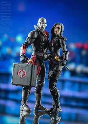
Ironically, that title would go to the Classified figure of The Baroness from the Snake Eyes movie. Based on Úrsula Corberó Delgado's portrayal of the character, though that's only obvious in the head sculpt. I love details like the shorter, more filled out hairstyle, along with the more angular glasses frames with smaller lenses. Details like that help modernize a character without subtracting from the original design. Another design element inspired by the original toy is the pure black costume with the red Cobra logo. Thanks to a healthy mix of matte black and glossy black, adding subtle separation in the detailing, it doesn't look as bland as you might think it would. One other change is the inclusion of heeled boots, helping to give the figure a sense of authority. One issue I have with the proportions is a minor one; I feel like the neck is a bit too long, something that's highlighted by the fact that this design for the Baroness has her wearing a Choker, along with paint on the torso to help better define her neckline. For accessories, she comes with a submachine gun with a removable silencer (yes people, a Classified figure that has a realistic weapon!) and two machete-like knives. You can remove the glasses, but I consider it more of an accessory to have the likeness align with the actor rather than the character. Because I don't recall her taking the glasses off during the film, they're something I prefer to keep on her and don't consider them an accessory. Though the Cobra Island one may fit in better with the rest of the line, Movie Baroness is an excellent representation of the character and one I recommend even if you're not collecting the Snake Eyes movie figures. 


Though my views are overall mixed when it comes to the four of them, I was pleasantly surprised with how much I appreciated Destro now that I've spent time focusing on him and how much I enjoyed the Movie Baroness. All four figures have the feel of a line still trying to figure out what it wants to do going forward, so it'll be interesting to see how 2022 treats the line, now that things like a pandemic delayed movie won't hamper it. I'm genuinely surprised the line has kept my attention, especially as this started life as an experiment. Marvel Legends didn't catch on, Star Wars I didn't end up trying because Star Wars content doesn't get much attention from my audiences, so to see the Joes, a brand that struggles outside of America, get interested in Australia enough for people to read the reviews of someone using them not only as an excuse to get into the brand, but also begin collecting traditional 6-inch figures has been quite relieving. I have more plans to review more Joes and Cobra characters in the future; maybe someday I'll give the Vintage toys a review as the vehicles were what got me interested initially. Until then, though, reviews will be put on hold until 2022... at least, that's what I would say, if I didn't have one last one in mind. There's not going to be a better time to review him, so next week: The Big Guy.

Sunday 5 December 2021

Transformers War For Cybertron Kingdom Deluxe Class Waspinator: Scorpion + Spider = Robot Wasp?

 A week late for several reasons, one of which I'll discuss at the end, so I won't waste much time with this intro. For the final Predacon review of the year, it's time to look at the Predacon Punching Bag. The indestructible yet incredibly disposable Waspinator. Try not to read this in a Waspinator voice, though. You'll likely hate yourself for it.


Waspinator in Waszp mode suffers from a similar issue to Scoropnok's scorpion mode, but it feels less egregious here. The bug legs are limited to swivel joints for the sake of the robot mode, limiting what you can do with posing for the beast mode, amplified by the fact that the middle and back legs are moulded together. It makes Waspinator feel more rigid when compared to some of the other Beasts in Kingdom, but it's not as much of an issue as, for example, Scorponok because... well, what are you going to do with a wasp? It would be nice if the legs could move a bit more, at the very least separating the middle and back legs to give some more natural flight poses for those who want to put him on a flight stand. As it stands, all you can move are the pincers and the wings when in this mode. On the wings, though, many have an issue with the plastic colour it was moulded in. To have the bug and bot mode eyes be purple. The wings were also moulded in purple. I honestly don't mind this, as I think the purple wings add a nice bit of extra colour to the bug mode. While a selling point of the Beasts was "realistic animal modes", in practice, a lot of them were stylized in some form or another for the sake of making toys. T-Rex's aren't purple (to our knowledge), spiders don't have golden legs, scorpions aren't purple. Just let him have this; he's the Predacons punching bag; he deserves something nice.


In robot mode, Waspinator feels more like Blackarachnia, in that the robot mode looks very cluttered due to Wasp Mode junk. It's a messy robot mode, but not one you can change because of its iconic design for Waspinator. Granted, it's not entirely accurate. The pair of bug legs on the robot legs are new for this take, as they're generally on the arms. Due to this toy re-imagining tricks from his 2013 toy, there are bug legs on the robot legs at all might be seen as an eyesore compared to the original toy. I'm also not a fan of how they handled the blaster. For the sake of beast mode storage and the fact that spring-loaded shooters are no longer a thing in Transformers, Waspinator's gun just looks like a random bit of wasp he's holding as a classroom pointer. It somewhat looks better with a blast effect (something that would have been nice to include, especially if it looked like his old stinger), but I'm not even sure if it is meant to be blast effect compatible, as the nub on the end of the blaster is a bit smaller then the blast effect posts usually are, making any effect really easy to knock off by mistake. An unintended feature likely caused by a minor quality control defect results in Waspinator's head being effortless to take off. But, it's something that works in this toy's favour, as Waspinator was known to come apart in the show. Now that I say that, I kind of want to see a Weaponizer take on Waspinator now.


Should you get Kingdom Waspinator? Probably not if you have the Generations one. While this one does look good with the other Kingdom Predacons, arguably a lot better than the Generations one does, it doesn't feel very interesting. It's a toned-down version of the Generations one, with a lot of the excitement gone due to the changes in engineering and the inclusion of gimmicks changing in the last eight years. The main reason this took a whole extra week to work on was that he's a mediocre toy to talk about, nothing terrible, but nothing stands out either. Like Dinobot, he's an average figure, but unlike Dinobot, the average toy is perfectly fine. The final review of G.I. Joe Classified is next week, ironic as I may be helping out a Transformers booth at the local Comic-Con that weekend. As much as I want to talk about Cobra Grunts, I think I'll close out the year for them with the last two members of the Cobra Leadership team released so far: Destro and The Baroness.

Sunday 21 November 2021

Transformers War for Cybertron Kingdom Voyager Class Dinobot and Grimlock: No, not Dinobot Grimlock.

When Kingdom was unveiled, there was a specific set of characters that people couldn't wait for, and were characters that a new toy of them would be inevitable. Dinobot was one of these characters, as not only is he a beloved character from the Beast Era, but a spotlight episode for him, Code of Hero, is regarded as one of the best Transformers Episodes ever made. Considering he's one of five Beast Wars characters (not counting reprints and Lio Convoy) to have a Masterpiece figure, not including him in the toy line meant to represent the anniversary of Beast Wars would be a disastrous oversight. However, a bit more surprising was the inclusion of his repaint, Grimlock, in one of two exclusives that bundled an Autobot with a Maximal. Granted, Hasbro will use any excuse to repaint a figure that they can get, so Grimlock was likely; it just felt like an odd choice to include with a new Mirage toy, especially when G1 Grimlock was available in the Studio Series line (though out of all the possibilities, it probably still made the most sense). We've tackled Optimus Primal, Cheetor, Rattrap, Airazor and Rhinox; how well does 2021 treat one of the most infamous warriors in the franchise (and his white cousin)?

For a lot of toys this year, the term "Mini Masterpiece" has been thrown around. While I think how it's being used is wrong, I believe there is a grain of truth to it. Many toys have borrowed elements from Masterpiece engineering to achieve the two modes. Still, due to the downscale of cost, the engineering's used mainly for large chunks rather than minor tweaks. Dinobot is an excellent example of this as while the base concepts in his engineering are similar to the Masterpiece in certain elements, the compromises are far more visible due to the smaller budget. This velociraptor mode looks ugly; there's no getting around that. Due to the robot legs needing to go somewhere, the entire underside of the raptor mode looks awful, and due to how much the legs stick out compared to a raptor's body proportions, there's no natural way to fix it either. From the top-down, the raptor model looks really good, and all the Kingdom signature beast detail is nicely on display here. However, even at this angle, the illusion is ruined by the robot mode feet. Compared to how the legs integrate into the toy, elements like the robot mode-specific deco visible in what would be awkward areas of the Raptor mode don't stand out as much. However, an eyesore is easily the Raptor hands. For the sake of robot mode engineering, the fingers are too long when compared to (what we know of) raptor hands and claws, and the locked position of them always makes the hands look awkward no matter what you do with them. Another compromise for the sake of the robot mode was the articulation.


Compared to other Beast Wars characters, Dinobot's raptor mode feels uncomfortably stiff, thanks to the locked neck, the immoveable tail, and the thighs being locked in place, denying the ability to get good running poses. In addition, many have complained about one element of this mode: the end of the robot mode's sword being used as the tip of the tail. Due to the paint on the sword is based on the Masterpiece's metallic pink blade, it leaves the tail with a pink tip. If that bothers you, Grimlock's sword blends in better with the tail, but I find the deco on him to be less impressive when compared to Dinobot. Also, elements like the deco on the dino thighs feel less interesting than Dinobots, an interesting turn of events as Grimlock was an exclusive repaint, often resulting in a deluxe paint job compared to regular retail. Unfortunately, that might be due to the one he was bundled with, Mirage, getting the deluxe treatment, a shame for those who were after the set for Grimlock like I was. I love Grimlock's green eyes, though, and it gives the beast mode a robotic feel to it that almost helps with hiding the robot mode junk trying to pass itself off as a Raptor stomach. 


With the beast mode clearly suffering, one can hope that it was all for the sake of the robot mode. Thankfully, the robot mode for Dinobot is gorgeous! Dinobot is almost everything a Dinobot fan would want in a Voyager Class representation of the character in robot mode. He's one of the more agile figures in Kingdom, thanks to the extra joints in the shoulders for the sake of beast mode. 5mm ports on the palms of his hands can help fake the tail shield spinning gimmick the original toy and the Masterpiece had while maintaining the friction to hold his gear. Unfortunately, it's not very useful outside of his weapons because most weapons are designed for regular hands (sorry, you can't have him hold G1 guns, I'm sad to say). Paint applications are beautiful, with the only thing that feels like a glaring omission is painting the bone details on his shins, likely cut due to the transformation. Thankfully the moulding on the legs is there, so there's very little extra work that would be required if you're into customizing your figures. For those that aren't, I don't see an upgrade kit coming that could help fix this as the joints are covered up nicely, with pins not designed to be removed, locking the plastic pieces together. Once again, though, deco seems to be the issue with Grimlock, as not only is he missing paint applications, but applications intended for beast mode look awkward in robot mode, coming off as half done. The outer half of the knee spikes, thighs, and feet are painted white to blend into beast mode, but it shifts to the colours for robot mode, down the middle of each, resulting in a half-painted mess. The chest is also missing details, as some aspects in the moulding intended to replicate the Beast Wars Cartoon's Raptor head chest that Dinobot uses to full effect are lost on Grimlock. It seems like the priority that was given to Grimlock was for the beast mode. Still, it looks like a wasted effort, especially when the robot mode's engineering is so well done due to how heavily compromised the beast mode already was. 


What's frustrating about this toy is that it's okay when a character like Dinobot deserves an amazing one. However, the issue with that mindset is that Beasts are always going to be compromised, and though this feels like too much of a compromise, it's hard to deny the sacrifices that were worth it when you see the robot mode. As a Raptor, Dinobot's toy is awful when compared to the other beasts in Kingdom's line, up there with Scorponok's beast mode due to how rigid it feels. As a warrior, though, the toy is practically perfect at the Voyager scale. The two cancel each other out though, to make the toy okay in the line, very average when compared to others. As for Grimlock, I wish it got the same Robot mode attention that Dinobot did, but that was probably due to Mirage needing so much of the packs budget.

Sunday 14 November 2021

G.I. Joe Classified Flint and Lady Jaye: Behold, Duke and Scarlet 2.0...?

 As the last few Transformers reviews have indicated, I've had the 1986 Transformers movie on my mind. Still, I did notice when comparing the original Transformers Cartoon to the G.I. Joe Cartoon running around the same time because it feels like G.I. Joe handled the leadership transition somewhat better than Transformers did. Ironic as a last-minute edit to the G.I. Joe Movie was done because of the backlash Transformers had. Though some leaders did take more of a backseat even when they were introduced, to me, it did feel like when Flint and Lady Jaye were introduced, they essentially replaced Duke and Scarlet. There was even an episode where leaders of both G.I. Joe and Cobra were taken for a series of challenges, and while Cobra Commander and Baroness were taken to represent the Cobra side, Flint and Lady Jaye were taken to represent the Joes. Even when an official chain of command was discussed, Duke wasn't in charge; he was now second in command behind the then-new General Hawk. It makes me wonder what would have happened if they committed to killing Duke off in the movie. While we may never know about that, what we can do is look at the newest versions of Duke and Scarlet 2.0. By request on a poll on Facebook, because of how close it was between these two and how many can't see one without the other, here's a review looking at both G.I. Joe Classified Flint and Lady Jaye.


I'll start with Flint first as, in the spirit of him being Duke 2.0. Though some elements are different, a new head, new shin guards, a few new accessories and the vest replacing Duke's belts, the bulk of the parts are reused, but using a fresh paint and colour scheme to make him feel more unique when compared to his Wave 1 predecessor. The reuse of components fits the two of them, thanks to how similar their roles are in the Joe team, and what elements are different make a significant change to how the two of them look. Even if you had the two of them standing right next to each other on a shelf, you wouldn't notice that they're essentially the same toy just by looking at them. For those looking for a faithful modernization of an 80's Joe figure, Flint is a mostly 1:1 accurate translation of his original 1985 toy, only missing his backpack from the original toy, but it doesn't feel like a significant loss.


Regarding the accessories he has, Flint comes with the same pistol that Duke comes with, but without the gold paint that Duke's did. While it looks more realistic, it also seems pretty bland by comparison. He also comes with what is essentially a Shotgun to serve as a primary firearm. I love the look of this gun, especially over the one he came within 1985. From what I've heard, it's not a realistic Shotgun, but the paint and sculpting is realistic enough to look like a modern shotgun, especially when compared to Duke's rifle. I'm less of a fan of how it stores on his back; it does feel like the holster designed for it was put on upside down. It doesn't look bad when stored away, but like many primary weapons in the line, it looks better in the figure's hands rather than on his back.


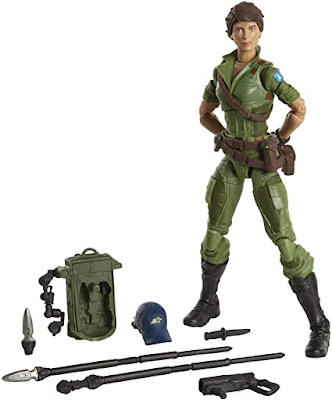
Lady Jaye, on the other hand, I find less impressive in certain elements but more impressive in others. She's a very mixed bag, as some parts have transitioned very well in the modernization process, while others have transitioned very badly. I love the sculpting on the figure itself. The design for her feels more like a translation of the cartoon rather than one of the original toys, similar to modern Transformers aiming for the look of the character in the cartoon rather than the toys. That's not to say she hasn't got any roots in the original toy. Like Flint, her design is primarily based on her 1985 toy, and the accessories help bring more of the toy's elements into the design. The inclusion of an optional hairpiece that has the hat the original toy came with is a lovely touch in this regard. However, the other accessories suffer in the attempt to merge the original toy's design with her design in the cartoon, all while modernizing the design for the 21st century. The backpack was completely redesigned to incorporate storage for a spare Javelin, optional Javelin heads that can be easily interchanged, and a modern redesign of the camera accessory her original toy came with, now looking more like a GoPro on a very articulate armature.


The Javelins are simple but effective in design, but what lets things down is the attempt to modernize her Javelin launcher gun. Trying to insert a Javelin in the launcher is surprisingly tricky, with a lot of friction between the pieces, making the connection feel too secure like it's trying to lock the Javelin in forever. The result is an awkward mess of a launcher that either sticks out too far or is cumbersome to hold. It would have been better if she came with a Mini Javelin to load into it, as that could have also worked for the backpack storage as her Javelins did compress for storage. I'm surprised her backpack doesn't have any Mini Javelins sculpted onto it, in a similar vein to Scarlet and Storm Shadow's Quivers. As it stands now, it looks like she has two shots before she has to rely on her knife, a weapon that doesn't work well when fighting an army all using guns. Granted, neither is Javelins, but a Javelin with an explosive tip would be more effective. 


With the exception of Lady Jaye's accessory choices (mainly the Javelin launcher), both these figures are solid inclusions in the line. Neither are the strongest the line offers, but both are fantastic inclusions to your Joe team. I could see Lady Jaye getting a re-release with different accessories, but they got Flint perfect right off the bat. Considering this was the first full year of the line and a year that was hampered by the delay of the Snake Eyes movie, it'll be fascinating to see what 2022 has on offer. Though the following review was sold as a Predacon, many know him as a Maximal. It's time to tell his tale to those who ask. To tell it truly, the ill deeds along with the good, and let him be judged accordingly. Up next: Dinobot.


Sunday 7 November 2021

Transformers War for Cybertron Kingdom Leader Class Galvatron: Now with 100% less Jet Mode.

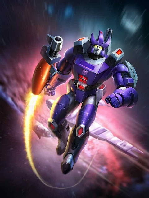
While Titans Return was justifiably praised back when it was the main Generations Toyline, very few Transformers toylines are without blunders. Some would argue that one of the biggest blunders the line had was its take on Galvatron. Though many of the choices for Voyager Class figures in the toy line were very questionable, Galvatron was one of the strangest as the goal was to make a triple changer out of a canon when the option for a toy gun was no longer going to cut it. As a result, Galvatron was given a jet mode that would make anyone with even basic knowledge of aerodynamics cry and a cockpit on his back that nobody asked for. If you have a seething hatred of Titans Return Galvatron, well, good news, today's subject does precisely what you want, have a purple Decepticon turn into a space canon. That alone would be worth an upgrade, but how well does Kingdom Galvatron hold up on his own. It's finally time to look at the last Herald of Unicron, in both cartoon and toy/kind of sort of comic colours.


Well... the one and only alt mode is undoubtedly a canon... As much of a cop-out bit of criticism as that sounds, it's hard to talk about G1 Galvatron's Alt mode because, like Megatron's original alt mode, it's interesting when compared to other Transformers but inherently not as exciting as something like a car or a plane, or a monster. You have small wheels on the tank treads and the angle leg (I don't know cannons), allowing you to roll him along the ground, and the joints in all three legs allow for you to angle the cannon. Apart from that, though, there isn't much to say. Elements like the front legs and the arms with treads sticking out the shoulders look bad but is a common thing for Galvatron. It's just how it has to work at the limitations this toy has (though one thing I do have to give credit to the Titans Return version for, the lower arms end up behind the main leg element, making it look more cohesive from the front). A pre-applied rub-sign sticker is the only major thing to bring up between the general retail release, and the Generations Selects release. Most of the differences become more noticeable in robot mode.


Missasembly issues on early releases of Kingdom Galvatron excluded (mine has the right shoulders if anyone is curious); I like this take on Galvatron, though I wish some minor things were addressed before release. I love the overall proportions, with the only minor exception being the panels on the side of his chest. While, on the one hand, it does break up the overall look of Galvatron and does make him look a bit too chubby (clearly, he's been putting on the lockdown weight, too), it also makes him look more imposing and stronger. The arm cannon is another element that I'm not a big fan of. I'm not a fan of where they put the 5mm post to connect the cannon to the arm, and I think the barrel looks a bit too long and a bit too thin. The 5mm post is my biggest issue with the cannon, though, as the ports on the arms limit you to either putting the cannon in a spot where it's accurately positioned on the arm but limits dynamic positions you can put him in. Your other option is a spot where the cannon should connect too and gives more articulation freedom, but makes the cannon look even longer and not sit in properly depending on the position of the upper arm. It's little things like those that, while they aren't that big of a deal in the grand scheme of things, become far more noticeable because this toy is so close to being a fantastic Galvatron toy. It's why I got the Generations Selects release as well, which has a colour scheme more closely aligned with that of the original G1 toy. It comes with a sticker sheet to give it more of the G1 toy details, but the base plastic and the Kingdom detailing is so well done that it feels redundant to include them. Combined with my disdain for putting stickers on toys (blame LEGO), and I've decided to keep them off. One thing I was surprised about with the Toy colours was the choice of Purple. It's surprisingly darker than the retail release and stands out beautifully against the muted grey (compared to the retail toy's heavy use of silver plastic). 


Both toys come with three accessories that are both interesting inclusions and redundant bits of plastic. First, both toys come with guns based on the design of his ship from the 1986 movie, The Revenge, something I do find odd as the original toy did come with a gun. The sculpting is beautiful on the weapons, and the two can combine to form an interesting looking sidearm, but it's always going to feel redundant compared to the cannons both toys come with. Something far more interesting was the inclusion of a Matrix of Leadership on a chain to reference his jewellery in the 86 movie. It's ok for a toy, though the chain does feel like a bit of an afterthought in the initial design concept. I have no issue with the chain being a solid bit of plastic; it feels a bit too small for me, though, resulting in the Matrix not sitting right. An extra link or two in length could have helped with this. Credit to them, though, I love the fact that Toy Colours Galvatron comes with the Creation Matrix from the G1 Marvel comics. I'm surprised a Creation Matrix repaint of the Matrix of Leadership didn't happen sooner. 


The issues I've brought up are just what they sound like, minor issues, nitpicks at best. Without a shadow of a doubt, this is the best mainline G1 Galvatron they've designed. Almost completely flawless; I doubt anything would be topping this any time soon. If you can find one, get it because you won't be disappointed.