Wednesday 16 June 2021

Lego Art 31203: World Map: Should we be worried the Arctic Circle isn't here?

Debuting last year, Lego began to release sets under the Lego Art branding, designed like a well-known form of fan-made creation, Mosaics. The fundamentals were pretty straightforward; each set comes with nine 16x16 plates that builders and artists put a collection of 1x1 dots on to form an image. Each set has instructions and pieces for a few different pictures that can be made alongside the box version. I was, and still am cynical of, the ones that encourage multiple purchases to get either a combination build or to complete a whole image (such as The Beatles), primarily due to the price not encouraging multiple purchases. These are $180 each, after all. So it was a surprise to see something as big as a World Map launch in this line almost a year after the theme launched, dwarfing the rest of the theme and having the most pieces of any Lego set so far. Over 11,000 pieces to pull off a customizable map of the world. It became a group project at my house due to its sheer size. While it has one of the best price to part ratio of any set to date, potentially forever, sometimes bigger isn't better. What you see is what you get, after all.


What you get is a simple build but a mentally taxing one for those who don't find comfort in these projects. For someone working on this build alone, they would be placing down 10240 1x1 dots. Each of the continents is studded, so you can place markers (of your choice though 40 1x1 cone pieces, along with many spare tiles are provided to help make some) on the rough locations you've travelled to. The ocean is a rough bathymetric representation of the world's oceans by default. However, the designers encourage you to fill in the negative space of the map with whatever you desire. Due to this, along with the ease of rearranging pieces of the world to change what countries are in the centre, the map is one of the most versatile Lego Art sets. Customization is baked in and encouraged compared to other sets (though nothing stops you from giving Darth Maul an evil villain moustache). From a distance, the map is beautiful when finished; the trouble with it comes pre-built into the issue many people have with making mosaics. I consider myself to be a pretty fast but patient builder. When I build, I like to focus on the build, give it my full attention, and because of that, the build process for this one was mentally draining due to the constant reliance on the instructions to make sure I put each of the ten colours of dots in the right place for my map pieces. You can't autopilot your way through the set. While it's possible to form some of the more significant landmasses, the oceans require your attention all the time, making the process of putting said 10240 dots feel a lot more draining. 


Part of that comes from the instructions for the build, where each piece of the map is two pages. One page showing where it is on the map and where you put the Technic pins in to connect it, and then the other showing a 1:1 picture of the map piece, with numbers relating to the colours to show where each piece goes. If the instructions were laid out with things like a part list (like other Lego set instructions) and divided the map between more pages, such as how the Lego NES handled the instructions for the TV screen, I think it would help with the process. However, while it might work for the 3x3 pieces, when you're working with a set that has almost five times the number of plates to fill, it's not going to work as well scaled up. 

A representation of all the places in the world that I've been too... I don't do a lot of traveling...
 

While this looks good as a novelty, I'd be hard-pressed to recommend it over a regular map. The scaling of the map means that some locations are outright missing, mainly smaller islands (I wasn't the best at Geography, but last I checked, Hawaii had four islands). But I dread to think of what a version of this map would be if it did have those islands and how much bigger it would be due to that. As a novelty item, it works very well, and the customization baked into the brand leads to this being a very versatile map. Still, if you want something for navigation, you're better off looking elsewhere.

Sunday 13 June 2021

Transformers Studio Series 86-05; Scourge: Bewear the evil space boat!

 Decepticon reviews might become a little dry soon. I'm currently working on a project that will review a lot of them in a marathon of content. I've got one more planned before that point, maybe two depending on how long it takes to obtain it, all keeping to the theme of the Heralds of Unicron (Unicron review not included because I don't own one). So let's start things off with a review of the first herald to arrive on shelves recently: Scourge, the tracker.


Starting in the alternate mode and... I wasn't kidding about this being a space boat. Many of the designs made for the 1986 movie leaned very hard into the futuristic aesthetic, tossing away grounded earth vehicles for stuff that looked sci-fi enough to still be cool, but lent themselves to stupid community names. No one knows what Rodimus Prime's alternate mode is supposed to be, and everyone calls it a Space Winnebago as a result. Does Scourge's alternate mode resemble anything? No. Does it look like it could genuinely fly? No. On its own, it's nothing spectacular, but when considering ship designs like the Ark and other Autobot shuttles, it's got a decent "Transformers ish" design to the alt mode. This design isn't something that fits into the "robots in disguise" mentality, and it's very much a "fast travel" mode for Scourge. For the actual toy, though, the design is alright, though there is some undercarriage due to a bit of robot mode junk. However, I don't find it distracting, compared to something like the Combiner Wars Silverbolt mould, due to it being so far removed from anything that resembles a traditional airship. It's only an issue at the very front of the boat, thanks to a gap for the sake of robot mode. Everything else blends in well enough to at least look cohesive from a distance. While it is amusing that you can recreate the "head poking out of the alt mode" scene from the cartoon, this is without a doubt Scourge's worst mode. 


Another significant fault of Scourge is the transformation. He is a shell former: a transformer whose alternate mode is a shell around the robot mode, with very few (if any) parts being used between modes. Almost all of Scourge's alternate mode ends up on his back, but in this particular case, that's not a bad thing. Unlike other transformers (such as the aforementioned Combiner Wars Silverbolt mould), the alternate mode parts that would otherwise be junk hanging off his back gives Scourge a strong presence on a shelf. It makes him look a lot more intimidating, and with the parts moulded in a way to make it look as close as possible to the design in the movie, it makes him look a lot more alive in the process. The shell former nature works to the figure's advantage in this case. If you remember, I put Scourge as one of the best figures I bought last year, and that's purely because of the robot mode, the presence he has thanks to the sculpting, how effortless he is to pose in intimidating positions. If it weren't for the rumours of there being a dedicated Sweep release of this mould, I would have bought even more of him to have a complete set of Sweeps in this mould (but the thought of buying at least two more of Scourge is still there). While there are some joints I wish he had, like double joints for the elbows and knees, the minor flaws I have with the robot mode can't bring down how good of a robot mode it is to me. I also love the fact that he comes with a blast effect for his rifle. I hope that trend continues in 2022 because the effect parts are great ways to add more playability and display presence to figures. It's also something I hope carries on into other Hasbro toylines, but that's a story for another day and a story that will require some... external support.


The alternate mode isn't great as a toy (though it looks great as a representation of Scourge's alternate mode). The transformation is laughable for a $50 toy. But the robot mode steals the show. I love the sculpting on the robot mode, and I love the proportions of the robot. I love that they painted his pink nails and beard (neither of which I was expecting). He's just a great representation of the character for the price. Perfect? No. Unlike figures like Hot Rod, he's not up to the same quality standard in terms of an overall package. If you're looking for a "mini-masterpiece" version of Scourge, this is not it. He doesn't do everything right, but the one thing he does right, he does so almost flawlessly. I've got another Lego set coming up this Wednesday, and next Sunday will be another 6-inch G.I Joe figure in the form of Roadblock.

Wednesday 9 June 2021

Lego Spider-Man 76178; Daily Bugle: A giant skyscraper for your quaint city

With the after-effects of earlier lockdowns still affecting me, work still not entirely returning to normal yet, I was itching for something big to build. At first, I was torn between the Mos Eisley Cantina and the Ninjago City Gardens. The former because I'm a big Star Wars fan, and out of the sets at that size in the Star Wars IP, it's the one that's got the closest chance of having somewhere to go in my room in its current state. The latter because it looks like an exciting build, with a lot of interesting uses of parts. The only thing holding back the Gardens from winning was that it doesn't look good on its own. Its main companion pieces haven't been on shelves in years and have skyrocketed in price as a result. Then, this set gets announced. Though it doesn't quite scratch the complexity as the Gardens would, it's of an IP I'm more interested in, it looks good on its own, and there's a possibility of there being more in the future. So, plans change, and so this set came home. After building it over the weekend, was it worth it?


Starting with the minifigure selection, and the best way to describe it is "is there a Spider-Man minifigure you've wanted? Chances are it's here.". Out of all the characters that have been in the Spider-Man subtheme of Marvel Superheroes, the minifigures missing are: 


  • Miles's regular costume (let me explain in just a moment) 
  • Vulture
  • Spider-Man Noir
  • Spider-Girl
  • Iron Spider
  • Iron Venom
  • Ghost Rider 
  • Stealth Suit Spider-Man 


Most of them, if not all of them, are still easy to get. The characters included in the set are: 


  • Spider-Man
  • Ghost-Spider
  • Mysterio
  • Venom
  • Miles Morales (using a look drawing inspiration from Into the Spider-verse, along with the recent PS4/PS5 Spider-man game (if only he had his backpack and cat to finish the look)
  • Sandman
  • Carnage
  • Doctor Octopus
  • Green Goblin
  • Spider-Ham
  • Gwen Stacy
  • Peter Parker
  • Robbie Robertson
  • Aunt May
  • Ben Urich
  • Black Cat
  • Blade
  • Firestar
  • Betty Brant
  • The Punisher
  • Daredevil
  • J. Jonah Jameson
  • Amber Grant
  • Bernie the Cab Driver
  • Ron Barney


That is impressive, with many of those minifigs appearing for the first time in physical Lego. However, some corners were cut to pull it off. The civilians/ alter-egos often reuse parts from other minifigs, and some characters like Green Goblin and Mysterio missing pieces to complete their looks; it's hard not to be impressed by the result of it all. Especially when put on display in and around the building, it's hard to notice the cut corners, and cases like the reused parts are only noticeable if you're very familiar with Minifig pieces. I can only imagine what the minifig list could have been if all of the requests were approved, as according to the set designer, 60 characters were at least being considered at one point.


As for the building itself, there are two big negatives it has in my mind. I am not a fan of stickers, so all the excessive sticker detail, especially on small tiles, is frustrating. If you're not a fan of sticker details, you are going to hate this set. The other issue is that it's a very repetitive set to build, thanks to builds like the windows, a process you're repeating 30 times throughout the build. If you're looking for something intricate, you're not going to be finding it here. While some exciting mini builds, like a vending machine, photocopier, and the Sandman stand, the main build isn't that exciting. Once it's done, though, it's awe-inspiring and worth the slog of a build process to get to. It's one of the tallest builds I've done so far, perfectly fitting for a New York Skyscraper, and the intricate details that reference as many Marvel and Spider-Man comics, shows, movies, and games are a delight for fans of the character. There's lots of space for displaying Minifigs, and with the even balance of heroes, villains and civilians, you can set up very dynamic moments. I could see this set also benefiting from a light kit, thanks to all the windows in the building. That being said, I dread to think of the wiring pain associated with such a task. Though I have one minor nitpick, I wish there were a recording floor considering all the news broadcasts and podcast references in the set. The only major issue I have with the set is accessibility on the ground floor for hands. For the sake of stability of the set, it's tough to get your hands and minifigs inside the lobby of the building, which is a shame when you consider how easily accessible the rest of the floors are, thanks to removable roofs and walls. A necessary evil, but it feels like a glaring issue when compared to the higher floors. 


While this is an easy recommendation for Marvel fans, I'm torn on if it's a good recommendation for general Lego fans or general consumers. While the end result is excellent, the process of getting to that point I can easily see as an issue for people, as it was an issue for me over the 10-12 hour build time over two days (not counting breaks for food, keeping video rendering going and other house responsibilities). If you're willing to push through the repetitiveness, you'll be left with a great looking display piece. However, the issue comes from if you're ready to place 347 windows, 67 beams, and 231 1x2 rails. If you can push through the repetition, and especially if you enjoy Marvel, I readily recommend this set. But if you're not into Marvel, you're probably better off getting something else. I've got a few other Lego set reviews to come in the next few weeks, so stay tuned for those. But while those will be on Wednesdays, the usual schedule will resume for Sunday, resuming with a set of Horrorcons.

Sunday 2 May 2021

MAYvel 2021 (Marvel Legends); Into the Spiderverse Miles Morales: Close, but no cigar.

 While the Main site will soon be starting MAYvel with a collection from Disney+, I thought I might use this as a chance to go through some of the other Marvel Legends I picked up. Because nothing says "riding the hype train" quite like reviewing toys from a few waves back from a movie that came out in 2018, does it? I mean, it is MAYvel after all; catch up is the name of the game here.

 
As with the Gwen Stacey, this represents Miles from the movie Spider-Man: Into the Spiderverse. However, while Gwen's design for the movie was mostly the same as it is in the comics, Miles' takes many more liberties. You can't pass this off as a comic Miles, thanks to the shorts, shoes, hoodie and jacket. The design itself is a bit of a mixed bag because while it looks good in the movie, it doesn't translate well to plastic. Unlike Gwen, though, one of the best things about the toy is the head sculpt for a maskless Miles. It's an excellent translation of the animation model, though there are other parts of the toy that I don't think translate as well. The shins look a bit too thin and skinny on the toy, which is heavily contrasted by loose-fitting shorts. Another minor nitpick of mine is the fixed neck. Due to the way it's sculpted, it kind of looks like he has a hunched back thanks to the way the jackets sit on his torso, but if you take the jackets off, other than the awkwardly coloured arms, it looks too long. The neck reminds me of Hungry Hungry Hippo when the hippo heads are extended to reach the marbles. 


Sculpting on the figure (prior nitpicks excluded) is well done. I love the sculpting details on the spider suit, and the work done on the sleeves to give the jacket a fabric texture look to them is impressive. I'm also quite impressed with the paint. The eyes on the mask stand out nicely. It is a shame, though, that the spider logo is lost amongst the red hoodie. Articulation is solid; he is far more agile than the Gwens were thanks to a resounding ab crunch, though the hoodie can get in the way at times of movement, mainly if you want to curve his back. The lack of a double elbow joint is annoying but not the end of the world.


The big takeaway for me from this figure, comparisons to G.I Joe articulation excluded, is that this makes me think, "Wow... I'd rather have a comic version of Miles." This toy isn't bad, far from it, it does the job it set out to do pretty well, but when I think of what Miles Morales looks like, this isn't it. I like his design in the movie, Into the Spiderverse is up there as one of my favourite Superhero movies. But just because I associate the character's personality with the movie form doesn't me I associate the design. The black and red spider suit looks cool, and the appeal of it is lost due to all the extra clothes this toy is wearing. Because of that, though, this feels like an "it's close, but I can do better." It's not bad, not quite what I'm after. I hope you stick around because while Sundays this month will all revolve around Marvel Legends, the main site will be mainly focusing on Disney+ streaming for MAYvel 2021, starting with The Falcon and The Winter Soldier. If this marathon of content goes well, great! If not, I can always default back to Lego if I need MAYvel content for the Toybox.

Sunday 18 April 2021

Transformers Earthrise Voyager Class Grapple and Kingdom Voyager Class Inferno: When is a good toy mediocre?

Another two for one this week. In another case of "I was waiting until at least the obvious repaint was coming", something that likely took longer due to the virus last year. Well, over a year since we first got the mould, it's time to look at Earthrise Grapple and Kingdom Inferno!


I'll start by going over the elephant in the room when it comes to the first release of the mould. People's common quality control issue was the pegs that connected Grapple's backpack to his feet in Crane Truck mode. This problem was something addressed in Inferno, where they made the pegs shorter. Still, the fix many people used, myself included, was to shave a bit of plastic off of the pegs before trying to turn Grapple into his vehicle mode to cut down on the friction connecting the pieces. If you're wondering which version of Grapple you have (assuming they've done a silent reissue that fixes the problem), gently try to push one of the pegs into the ports on the feet. If it feels like you're putting too much force into it, take it out before you go further, take a knife, and shave some plastic off of the sides of the pegs before trying again.

Starting in the vehicle modes, and right off the bat, we have their worst modes. On their own, they look fine, with a lot of lovely detailing. Though the ladder and crane arms could be longer on both figures, the biggest issue both have is the size. These two are meant to scale well with other figures in Robot mode, but due to the nature of their vehicle modes, to achieve that task, the vehicles look tiny compared to any other Generations vehicle. Scale isn't usually an issue for me; as long as vehicles and robots look good when together, I'm willing to look past the size issues. When there are some alternate modes like motorbikes, animals, dinosaurs, realistic firearms, and other similarly troublesome modes, it's hard for me to get worked up about things not scaling right. However, these two bother me. They never look good in vehicle mode when next to anyone other than each other. They're just too small!


I get why they needed to be small, and the ends justify the means when we get to robot mode. It's just an unfortunate side effect of the alternate modes. The retooling done to separate the two is minor, though effective. With Grapple getting a crane arm with an optional claw end, Inferno has something that loosely resembles a fire ladder, a nozzle on the end of it, and some fire hoses that peg onto what will be his robot mode shins. Grapple's claw has the best use of gimmick compatibility, with a clip in the middle of it that can connect to the road pieces used for your Micromaster bases. With it connecting via a 5mm port, you can plug anything onto the end of the crane so long as it has a 5mm plug. It's little things like that which add a lot of enjoyment to a figure, and it's a shame that they didn't find a way to replicate it for Inferno's fire ladder. 


As I said, the reason for the small trucks is for better-proportioned robot modes. While the transformation isn't anything exciting (as is typical for Inferno/Grapple toys, everything tucks in behind the chest as you turn robots into logs with wheels), the robot modes do look great when you get to them. These are some of the best-proportioned Transformers I own, and because of that, people have been able to do a lot of exciting and hilarious things with them. However, for some reason, I don't get much enjoyment when messing around with them. They just come off as rather dull to me, though I'm not quite sure why because there's nothing objectively wrong about their robot modes. That's something I noticed a lot in Earthrise. While there were several toys in it that were objectively good for what they were doing, something didn't quite click with me about them. They don't feel like they had a presence to them other than being good representations of the characters like there's no life in them. I know that probably sounds weird to people that don't collect toys. It probably sounds strange to people who do. But to compare it to the last review a few weeks ago of Cobra Commander, that figure has no face and is only expressive through hands, yet it feels more lively than these two. Even their wave mates, Earthrise Starscream and Kingdom Megatron (for Grapple and Inferno, respectively), feel more alive than these two do, and one of them is a glorified upscale of a toy from 2006!

Tiny truck mode aside, these two are good toys objectively. They're just underwhelming for me. Maybe it's my lack of general interest in the characters. Perhaps it's the fact that they always transform the same way. Whatever the reason is, they just come off as a bit lacklustre to me. Both are readily available in stores if you're after them, Grapple more so than Inferno, thanks to how much leftover stock of Grapple there is lying around! If you get more out of them, then great! Feel free to tell me what I'm missing because even I'm not sure what exactly my issue is with these two.

Sunday 11 April 2021

Opinion Piece: Hasbro Pulse Fan Fest 2021

Because the April Schedule is already out of whack anyway.


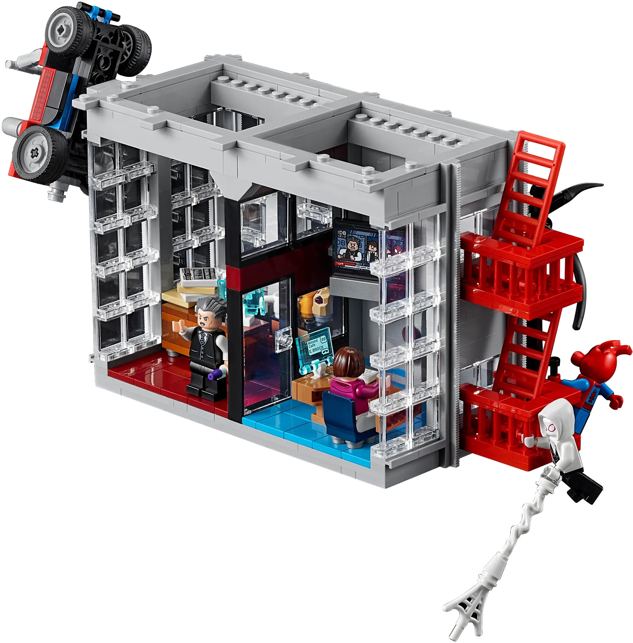
With the continued struggle of running events, Hasbro has decided to stream product reveals for six toy brands. Four licensed brands, two in house brands so that people who have access to Hasbro Pulse (without needing to resort to PO Boxes) can see what's coming up and what may join their collections. Instead of a regular review, I thought it would be interesting to go through the four and a half hours of live-stream, taking a break to finish building a new Lego Set, which will be getting a review soon, and see what new products are on the way. Here are my thoughts on the first Hasbro Pulse Fan Fest. 


To quickly get one thing out of the way. The six IP's that are focused on in this presentation. Transformers, G.I Joe, Star Wars, Marvel, Power Rangers and Fortnite. I actively collect two of these brands. I don't delve hard into merchandise for two of the brands here, choosing to focus more on the media they output, and the remaining two I don't care about in general. If you're coming here looking for my deep thoughts on the Power Rangers and Fortnite stuff, you're going to be disappointed as I didn't grow up watching Power Rangers, and I don't play Fortnite. 


I'll be going at this in order of reveals, but as an AV technician, I do have to call attention to awkward and frustrating aspects of the presentation, especially early on. Awkward camera transitions, the presenter's focus on the wrong camera, showing bad set direction early on, along with the continued use of "talk from the office via webcam", something that is a case by case technical issue depending on where the person lives and what they've done. There was stuttering, one of the people presenting in the Power Rangers muted themselves and didn't turn it back on, just minor issues like that which make the overall presentation look and feel kind of cheap. I was also not a big fan of the pointless padding like the Trivia, small Q&A sections, and talking to some fans moments that killed the presentation's pacing. Those shouldn't have been in the main show. Also, while I won't be going into details, I will still talk about all six IP's so going in order, relatively blind, so if it sounds disjointed, that's because it likely is. With that said:


Fortnite: The Victory Royal line looks alright overall, though, with my lack of knowledge on the game, I don't know if these are just fancy skins or actual characters, maybe both? It's why there are reveals that I'll be skipping because I can't think of much to say other than "looks alright". Ripply looks cool reminds me a bit of Minion from Mega Mind, but I'm cautious about how well those translucent joints will hold up over time. It seems like a very risky figure to be starting with engineering-wise. Lynx looks a bit too much like robot Catwoman, though I hope the articulation is carried over into other lines. Scarlett, the one female G.I Joe I have so far, only has single joint elbows, and I've heard Marvel Legends fans have been clamouring for better articulation in female characters for a while now, so hopefully, it happens. Shadow Meowsel (Meowsle?), the details are lovely, but I do find it odd that they released the obvious repaint first for this new line, though I shouldn't be surprised based on what I've seen from other toylines. The shark seems to be just a fancy accessory pack. I'm guessing a Loot Lama will be on the way based on how the accessories store in the shark. Will I go in on this line? No. As I said, I don't play the game. I've got no interest in these characters. I've not seen enough about them to know about any personalities they may have (compared to Overwatch, another shooter I don't play, but the characters do interest me). I might do a review of some if I get a chance to borrow the figures from someone interested in the line, but for the time being, I wouldn't expect to see more Fortnite on either site. 


Transformers: Purely because they addressed it in the presentation, Hasbro does need to get a lot better about leaks when it comes to Transformers. The new Titan looks fantastic; it's nice to get a Transforming Ark, and while I have minor nitpicks about the gaps for the sake of transformation, they do look bad in vehicle mode. It does, however, look very impressive as a whole. The Ark might be the first Titan I own because of how good it looks overall. Rodimus Prime, when I first heard about it from leaks, I wasn't impressed, as I don't care about Rodimus' trailer being a trailer. I was hoping it was going to be integrated into the transformation. After seeing pictures of it, though, and seeing all that it can do, all that it comes with, I've warmed up to it more. Ignoring what I wanted it to be, this Rodimus does look to be a great looking Rodimus. Galvatron I was excited for the moment we heard it was coming, and after getting Scourge and Cyclonus in hand, Galvatron doesn't look as impressive based on the pictures, but not to the point of it looking bad. I'm still loving the look of it and can't wait to get it. Scorponok looks fantastic, probably one of the best looking Scorpion Transformers so far, though that's not too hard to do. Wing finger looks alright, not too big on the fossil mode primarily due to the dinosaur they chose, but the robot mode looks great. I'm going to try and make the fossil combiner when I get all three fossilizes. Not entirely sold on Tracks, I think he looks a bit too bulky in robot mode, but the car mode and flying car modes look great. I can't wait for Rhinox, Dracodon's a Vertibreak repaint; see my review for my thoughts on that. Not sure if it looks good in green, though. Soundwave I'm not too interested in mainly because I'm not collecting the core class G1 characters. The only one so far that interests me is Megatron because of the accessory. Astonishingly, he comes with a Lazerbeak cassette, and because of that, I might change my mind depending on how well he looks in tape recorder mode when next to bigger figures. Tricranius looks cool, and I love the fact that they're doing a blast effects pack at last. I'd love to see them do more blast effects in different colours, especially if weapons that are blast effects compatible are going to continue going forward. Shattered Glass Blur, 1/5 figures that are going to be Shattered Glass repaints. I wish we could see more of those figures, but Blur looks excellent. I'm hoping to get the Shattered Glass two-pack sometime this year, and this one will look great with Prime and Ratchet. The final thing revealed is an app and voice-controlled Optimus Prime. This has been floating around for years as what looked like a Robotics designer's personal project, now given a mass retail release. It looks cool, but not the likely over $1000 cool. Though it's a shame that Studio Series didn't get any love, and it was so Kingdom focused, the fact that this paragraph is as long as it is shows you that there was still a lot of info released that I'm excited for. There will be a Fan Friday in May that'll show more off, hopefully including Studio Series?


Power Rangers: A significant focus for this section of the presentation was on the media side of Power Rangers, game updates, a new comic, episodes of the shows being uploaded to Youtube, along with unknown collections that will be retail exclusives in August. I don't have much to say about those. For the Lightning Collection, they first showed off the remaining team members of the Mighty Morphin Metallic Power Rangers. Yellow, Blue, Black, and Red. They look good; the glitter effect looks OK, the weapons look alright and will look good with the already released Pink one. Finally, they showed off the Boom Studios Tyranosaurus Sentry, and again, it seems fine. It might be the cape, but it looks like it'll be awkward to pose in exciting ways and doesn't look as expressive as the other figures shown (well, the digital renders they offered). The weapon effects on all the figures look great, though, and I think those interest me the most out of all of the reveals in this section of the stream.


G.I. Joe: The focus for the Joes was the product reveals for the upcoming Snake Eyes movie (which we're still waiting on a trailer for). The kids' roleplay items look fine, though I get the feeling the sword will be a bit difficult to hold for kids, at least based on the video itself, for all I know they're the same size as Lightsaber hilts which will be fine. Out of all the roleplay items, the spring-loaded staff would have interested me the most as a kid, but I could see them causing issues for parents. Parents beware when it comes to those toy Ninja weapons. The kids' action figures look good as well, a Joe equivalent of lines like Transformers Cyberverse, looking closer to the Deluxe class for them. The weapon combination gimmick, along with the spring-loaded attack gimmick, looks fun without being intrusive to the figure (they're not going to be as poseable as the Classified series, but these don't look to be as invasive as gimmick focused Transformers). The figures look good; not a big fan of the Baroness and Ninja Tech Snake Eyes, though. However, some accessories like Storm Shadow's quiver and a dagger that Baroness comes with seem to give off the impression that they'll work well with the Classified line for those who can't find the Classified versions on shelves. The Character and Vehicle figures don't look great to me. The characters look good, but the bikes feel forced in, and I'm not sure how well the gimmick will work considering they're motorcycles. I love the look of the Classified versions of the movie characters. They're different enough from the regular Classified figures that they stand out while not looking so drastically different from the familiar 80's aesthetic to not clash with the current Classified figures, at least when compared to the Transformers modernized looks compared to their movie designs. A solid presentation overall, but it's hard to be excited for a movie where there's no trailer for it yet, especially a movie now coming out in July this year.


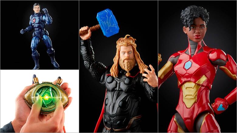
Marvel: Starting with Marvel Legends Retro Wave 3, Bullseye, Grey Hulk, Invisible Woman, Cyclops, Ant-Man and Vision. While they look good, not too into 3.75-inch figures, at least on their own (something that I hope to elaborate on in the future). Going into the 6-inch stuff, Quazar looks well done; I just don't have much to say about him. I love the look of Classic Ultron, with there being just enough mechanical detail to give him some texture without going too far away from the comics. Evolt Guardsman looks fine; nothing really to say about him as I've never heard of him before. Hologram Iron Man seems interesting, but as with Ripply in Fortnite, I question how durable the material will be due to the translucent body. I love the look of Stealth suit Iron Man, along with Iron Heart. They did bring attention to the fact that Riri will have double pinless elbows, so regarding my comment about Lynx, there's a good chance the articulation improvements carry on into other lines. Not sold on Darkstar, to be honest, at least when compared to the previous reveals of the Iron Man wave. All of the figures from Ultron to Darkstar will come with components to make Ursa Major, which looks very impressive, but I would probably be more impressed if I knew who Ursa Major was. Stand alone from those in the 90's Modular Armor, which looks great and a good representation of the 90's armour. I could see people who played (what I'm assuming to be) Marvel vs Capcom enjoying the look as well, potentially keeping them around as new fans. The Iron Man suits are tempting, along with Iron Heart and Ultron; the others aren't interesting to me personally. In terms of the MCU stuff, while they couldn't show Disney+ figures, they did show off Thor from the final battle in Endgame. The sculpt looks good, and I like the effects parts, but I'm not a fan of the translucent blue weapons. They don't look good without the effects parts, which is a shame for those that don't want to use them for displays. A new piece of Legends gear is the MCU Eye of Agamoto, complete with a glowing, Removeable Time Stone. For people who like collecting the MCU gear, they're going to love this, and I can easily see this working well as a cosplay prop. After going into some details on the Haslab Sentinel, it appears that the next project they're going to try and crowdfund is a Galactus, at least based on the teaser and a teaser for the second wave of Age of Apocolypse revealed a Sabertooth coming. It is a nice mix of reveals, maybe not so much if you prefer MCU figures, but still solid overall.


Star Wars: Up first for Star Wars is the Galactic Snacking Grogu, based on his hunger from Mandalorian Season 2. An electronic Grogu toy is about what you'd expect it to be; looks fine. I hope you're not sick of Baby Yoda merch. After that came the reveals for the Vintage Collection. Re releases/ remakes in the collection include Luke Skywalker in his Hoth outfit, Han Solo in his Endor trenchcoat, Admiral Ackbar, and the Royal Guard. They look good for 3.75-inch figures. A new subline in the Vintage collection themed around Star Wars game characters was revealed, with the first wave including Heavy Battle Droid from Battlefront 2 (they didn't say which one), Shadow Stormtrooper from The Force Unleashed (which looks nice to me but, once again, translucent body parts), Scout Trooper (which looks to be a regular Scout Trooper but with new harness and a stun baton), and Electro-staff Purge Trooper, both from Jedi Fallen Order. The four figures look great, but I find it odd that it's all army builders and no characters from the games in question. Going to the 6-inch Black Series figures, they revealed figures they teased back in January, including General Lando from Return of the Jedi, Aura Sang from the Prequels (most notably from The Clone Wars), Tech from The Bad Batch, Zero from The Mandalorian, and Koska Reeves from The Mandalorian. All of these are faithful to their representations in Star Wars, though I am surprised they've finished The Bad Batch and Bo Katan's team so quickly, especially when there are (apparently) other teams and squads missing characters. Black Series Role-Play (I didn't catch the actual name) reveals include Wedge's helmet (which is probably a repaint of Luke's helmet, so again, looks fine if you're collecting them). The final reveal for the section was a Rogue One X-Wing for the Vintage Collection, along with an Antok Merrik that will be bundled with it to pilot it. During the presentation, a fan vote started to bring a vintage collection figure back into production in 2022. You can find it on Hasbro Pulse's social media channels. Maybe it's the fact that this took me all of Saturday to write (and I still need to do the thoughts on the presentation, the opening and closing paragraphs), or it's the fact that I don't collect Star Wars toys. Still, nothing in this section of the presentation interested me. 


Final thoughts on it all? I like the fact that Hasbro does product reveals like this and their Fan First Fridays. I hope that even after things fully recover, they continue to do them as it helps keep the excitement going between press shows. But, there are still some bugs to work out. I hope that if they keep working on them, the web cameras from home/ office stop once they can get people back at work, give the presentation a more professional look, and avoid technical hiccups that have frequently appeared in these kinds of events. I also think they need to strike a better balance in terms of the amount revealed compared to the discussion on the reveal. Four and a half hours is a lot to get through. Stop Motion trailers might be a thing to consider to show off a figure, what they come with, how they move, something that the designers would discuss. However, that will depend on how much they can cut the production time down. The padding, such as trivia and fan opinions, is also a pace killer; I think that kind of stuff is best saved for a post-show stream that could go into more detail on the reveals. I hope this was good read for you, I'll have a review of something for next week.

Sunday 4 April 2021

G.I Joe Classified 06; Cobra Commander and Regal Cobra Commander: And now for some different forms of buckethead.

For every hero, there is a villain, or at least there should be. The 1980's G.I Joe reboot, A Real American Hero, wasn't originally going to have an offensive force to fight against. Originally, Hasbro wanted the Joes to fight other companies toylines like Star Wars. I can imagine the epic battles between the Joes and the evil forces of Lego Castle. When Marvel, who was working with Hasbro to develop a comic series to tell the toyline's story, told them "No", a random idea resulted in the creation of the Joes, now infamous villains. Cobra, "a ruthless terrorist organization determined to rule the world"... it was the 80's, terrorism wasn't immediately associated with radicalized Muslims flying planes into buildings and bombing places in the general culture that's quick to label anything and everything in black and white. Well, now that I've probably pissed a lot of people off with that comment, let me quit when I'm behind and review that one time Starscream was the leader of an army and why it was probably for the best that he never gets to lead the Decepticons, Cobra Commander.


For this review, I'll be looking at two versions of the Commander. The general retail release Commander, which has a darker, more realistic colour palette, and the Hasbro Pulse exclusive Regal Cobra Commander, boasting a brighter cartoon and 80's toy accurate colour scheme. There is a third out there that was a San Diego Comic-Con exclusive before COVID happened. It became a Hasbro Pulse exclusive with more accessories and a different colour scheme, going for a mix of black, red and gold. Due to the fact that shipping is a problem, and I'd rather not spend triple digits on a $40 figure, we're not covering it in this review, ok? Ok.


I'll quickly touch on the articulation, as while it's similar to Duke's from back in February, both versions I have seem to suffer from different quality control issues. On the regular retail version, the hinge in the shoulders to help bring the arms closer to each other rarely wants to stay in any position other than getting the arms in closer, especially the left shoulder, though thankfully, the Epaulette does hide that. When using some of the accessories, you don't even notice it. The Regal variant doesn't have that issue in the shoulders, but the ab crunch ratchet is uncomfortably stiff and does not feel good to use, at least on my copy. If you ever wanted an example of how the QC is in the Classified line and how varied it can be, that should give you an idea when comparing two versions of the moulds. One minor note that may or may not be quality control, the rubber sashes and Epaulette are noticeably looser on the regular retail copy than the Regal version. However, I don't know which one should be correct in terms of application. 


The sculpting and paintwork on both figures give Cobra Commander a very ornate. It's fitting for a character that is so over the top in terms of personality (at least going off the 80's cartoon), and the Military General Dress Uniform fits this personality perfectly. The dark blue and black colours make up most of the colour on the figure on the regular retail release, with beautifully contrasted accents done in silver, gold, and dark red paint. I love how the snake motif is integrated into the sculpting without overpowering the look. It's on the strapping and Epaulette, the sheath for the sword, the black patches on the coat (not counting the gauntlets) and red striping on the pants. Enough for it to be noticeable, but grounded enough to have it still be a realistic-looking uniform. Regal Commander shares this aspect with the sculpting, but it's harder to notice on him due to the brighter colours. Everything that was dark blue on the regular version is now a more brilliant blue, in line with the 80's look. The black patches on the coat, the red striping, and the black gauntlets and boots have all been swapped out for dark blue. Anything that was silver (except for the visor) is now gold, giving him more of a presence due to how loud the colours are compared to the general retail version. The only complaint I have with the paint is that the gold doesn't look as durable or as well applied as the silver, but even the silver on the regular retail version has some issues when it came to the application, mainly the front of the left shoulder.


I love the head sculpts on both of them. There's enough detail to make it look visually interesting, without things being distracting, like many of the designs from Rise of Cobra. It's a shame that he doesn't come with an alternate head to look like the Hooded Cobra Commander in any version of the figure, but the accessories he does come with are good enough. While I wish he came with the sceptre as Snake Supreme does, both figures come with a handgun that's sculpted beautifully while still keeping the snake theme toned down. Due to both guns only being one colour, the snake detailing looks more like ornate detailing, which fits the figure as a whole. The same thing sadly can't be said for the sword. Both figures come with an elaborate dress sword that, while the blade looks solid and formidable if you dare try to put it into his right hand, something I haven't tried to do, the Cobra head for a sword hilt stands out badly against the rest of the figure's more toned down snake aesthetic. I wouldn't mind as much if he came with the sceptre, but as it is, it looks awkward. Unlike all the other figures released so far, Cobra Commander comes with four hands, two left hands and two right hands. For the left hand, you have a fist or an open hand that could be either a "resting comfortably hand", "resting on sword hand", or an "I'm going to rule the world!" acting hand. You have a trigger finger grip hand that will hold the gun and a pointing hand on the right. These hands sell the figure. He's surprisingly expressive purely because of the hands for a guy with a mirror for a face. It would have been nice for the figure to come with a version of each position for both hands. It would be excessive for a figure to be released with eight hands, but the possibility for photos and displays would be worth the CAD file mirroring required to pull it off. I hope to have some picture tests in a new photo set up on my twitter feed sometime during the week.

"Decepticons! Megatron has fallen! I, Cobra Commander, am your new leader!... Wait, wrong series, but you should make that red, white and blue jet with the beautiful voice your new leader!"
 

Like with Duke, Cobra Commander is a nice modernization of the original character. But unlike Duke, the sci-fi elements don't clash as hard against the design, partly because Cobra always had one foot in sci-fi and didn't need to get around the logic loophole of realistic, modern army people using space guns. While Duke can look a bit too generic as a general army person at times, this is unmistakeably the Commander. Both the regular and Regal versions have their unique charm, and both are worth picking up, depending on your preference.